Eye-catching copy catches eyes and great email design prompts engagement. Here are six email design best practices to follow, plus real-life examples.
- Email design best practices
- 1. Prioritise precision and clarity
- 2. Think about white space
- 3. Guide the eyes downwards
- 4. Use web-optimised imagery
- 5. Be consistent with your branding
- 6. Use a responsive design
- What great email design looks like
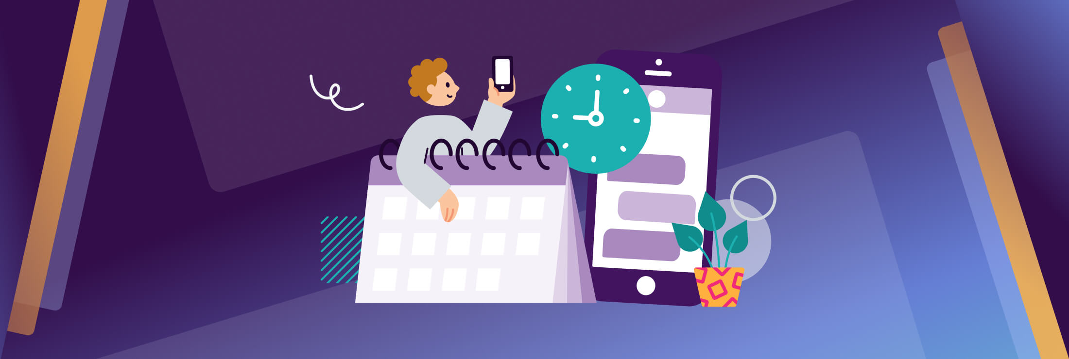
- Monday.com’s event invitation
- Zendesk’s quarterly email newsletter
- ASOS Sample Sale’s announcement
- Lucy & Yak’s product restock alert
- Figma’s newsletter
- Amplify your communication strategy with well-designed emails
There’s an estimated 4.3 billion people using email worldwide and this number is estimated to grow to over 4.7 billion by the end of 2026. It’s no wonder that more than 80% of businesses are using email to communicate with customers. The challenge now is ensuring your email stands out from the noise.
While great email copy makes a difference, email design also plays a crucial role. In this article, we’ll discuss some email design best practices and examples to inspire you.
Email design best practices
- Prioritise precision and clarity
- Think about white space
- Guide the eyes downwards
- Use web-optimised imagery
- Be consistent with your branding
- Optimise for mobile
1. Prioritise precision and clarity
People spend an average of nine seconds looking at an email so ensure your emails are easy to consume. In addition to short, snappy copy, make sure your design is also clear and concise. That means:
- Short paragraphs
- Sections in digestible chunks
- Content that will work on multiple email platforms
2. Think about white space
White space can make a powerful impact in design. Not only can it ensure your emails don’t feel overly crowded or visually overwhelming, but it can help emphasise important sections.
3. Guide the eyes downwards
Your email design should encourage people to continue reading. As we instinctively move downwards when reading, build a design that guides eyes down the page. And depending on the goal of the email, you can experiment with different shapes, for example:
- An oblong shape works well for email newsletters which are filled with valuable resources.
- An inverted triangle is great for important notifications e.g. security alerts or reminders.
- A zig-zag is perfect for sales announcements and product launches so your readers move from side to side.
4. Use web-optimised imagery
While you should use imagery to break up copy, make sure these pictures are optimised for the web so they load quickly. The ideal image size for emails is between 600 and 650 pixels. Then, add descriptive alt text in case the images break or your recipient is using a program for those with visual impairments.
Tip: While GIFs can add an edge to your emails, too much animation can slow down loading speed or be distracting. So, use them sparingly if you do decide to include them.
5. Be consistent with your branding
When your recipients open your email, they should know it’s from your business – not just from the email address but from the overall branding. Keep your emails on-brand by using a design style that complements your other content e.g. social media profiles, website, mobile messages, blog etc.
Today’s consumers typically engage with businesses across various channels as they move through their customer journey. So, ensure that your messages stay brand-consistent, no matter which channel you use.
6. Use a responsive design
A responsive design means that your email will change its format to fit the screen it’s being viewed on. So, similar to how consumers will move from channel to channel throughout their journey, they’ll also use various devices – from desktop to mobile device.
Cater to different consumer preferences and you’re one step closer to a seamless user experience.
What great email design looks like
Monday.com’s event invitation
- Call-to-action (CTA) is at the top so it’s not easily missed.
- Short, concise bullet points to summarise the event and what an attendee will get out of it.
- Icons that align with Monday.com’s branding and are more interesting than a plain bullet point.
- Clean design that makes the most of white space.
- Top image is actually a GIF – it features a spotlight moving across the screen, showing the recognisable Monday.com platform when the light is on it.
Zendesk’s quarterly email newsletter
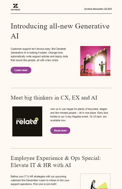
- There are multiple CTAs but they stand out against the background
- Despite it being ‘content-heavy’, dividers and headings break up the copy.
- Simple, repetitive design makes it easy to predict and consume.
ASOS Sample Sale’s announcement
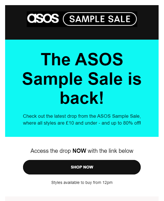
- A great example of an inverted triangle.
- Thanks to the bright background colour in the banner, attention is immediately drawn there before quickly moving down to the CTA button.
- The aim of this email is clear – to drive subscribers to browse the sale and make a purchase.
Lucy & Yak’s product restock alert
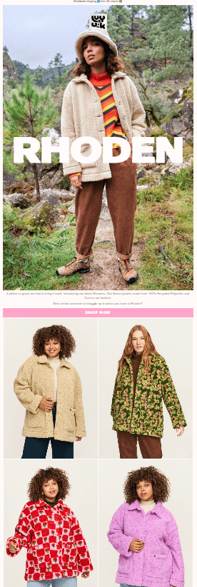
- A zig zag layout that encourages people to look from side to side as they scroll.
- As it’s quite image-heavy, the ethical fashion brand has toned down the rest of the design (e.g. the background colour is light and simple).
Figma’s newsletter
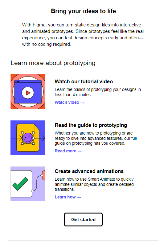
- A simple layout that encourages downward scrolling.
- CTAs are clear and easily spotted (they’re in a different colour to the rest of the copy).
- The aim of the email newsletter is clear and the main CTA supports that.
Amplify your communication strategy with well-designed emails
Maximise engagement and the ROI of your campaigns when you prioritise email design. At Esendex, we’re experts in business communication and we’re empowering our customers to be the same. Learn more about what we can do together by reaching out today.
Laura Haynes
Hey I'm Laura, UK&I Marketing Manager at Esendex 👋 I enjoy developing and implementing marketing strategies and campaign experiences that create brand awareness and drive revenue by winning, growing and retaining engaged customers.